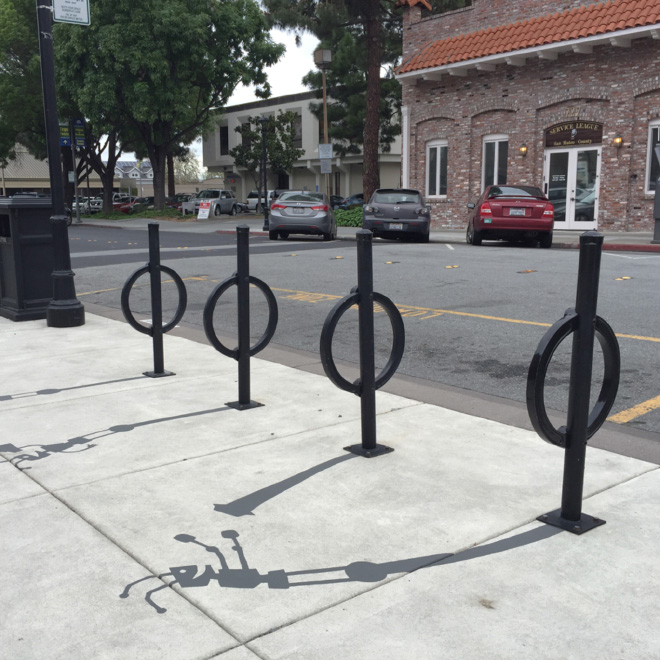
(From www.virtualinstructor.com and www.circlelineartschool.com)
One of the ELEMENTS IN ART IS DEPTH AND SPACE.
It is important to be able to create the illusion of space on a 2D surface. In reality, all realistic or representational art depends on the creation of an illusion. If creating realistic art is what you're after, then having the ability to create the illusion of space on a 2D surface is a skill that you will find useful. There are a few tricks that you can use to create the illusion of space. There are ways to create the illusion of space on a 2D surface.
Use them together to maximize the illusion.
How to Create Depth
1. Overlapping - When one object is positioned in front of another object, part of the object behind it may be blocked from view. This is called overlapping.
2. Shading - Creating volume using gradients from darker to lighter.
3. Placement on the Surface - Generally, objects that are positioned lower on the picture plane will appear closer than objects that are positioned higher on the picture plane.
4. Size - Objects that are closer to a viewer appear larger than objects that are further off in the distance.
5. Value and Focus - Objects that are closer to a viewer appear darker in value and warmer in color. Objects that are further away appear lighter in value and cooler in color. Objects that are closer appear more detailed than objects that are further away.
Techniques used for applying shading to an object are quite varied. Each technique produces a different texture and "feel" to the drawing. The drawing medium used may determine the shading technique that is applied in the drawing.
The most common application techniques include:
Hatching - Lines drawn in the same direction. By drawing lines closer together, darker values are created. Leaving more space between lines results in lighter values. For rounded objects, the lines may curve slightly around the form - following the contours of the object.
Cross-Hatching - Lines cross over each other. The density at which the lines cross over each other determines the value that is produced.
Blending - Smooth gradations of value are produced either by adjusting the amount of pressure applied to the medium or by using a blending tool, such a blending stump.
Rendering - Using an eraser to remove the medium to produce lighter values. This technique is typically used in conjunction with blending.
Random lines- Loose applications of crossing lines. The frequency in which the lines cross over each determines the value produced.
Stippling - Applying countless small dots to build up darker values in a drawing. The density of the dots determines the value produced.
What technique is the graphic artist Suso33 using here?
The Illusion of Light
It's easy to get caught up in the technique in which the material is applied and loose sight of the reason why we apply shading in the first place.
Light is how we see, after all, and shading informs us of the light within a scene. We understand the light within the scene through the use of value and contrast.
Value is the darkness or lightness of a color. Light values are called tints and dark values are called shades.
Contrast deals with difference. Contrast is produced when any difference between elements such as texture, color, size, or value occurs. It can be subtle or extreme. When it comes to shading, we are mostly concerned with the contrast that is produced from changes in value.
When light hits the subject, it produces a range of contrasting values. The intensity of the light determines the contrast of values. Generally, the stronger the light - the higher the contrast.
Values are arranged on the subject according to the location and intensity of the light source (or sources). To simplify the manner in which light behaves on a subject and surrounding objects, we'll look at what happens with just one light source on a smooth surface.
Locations of Value
Highlight- The highlight is the location on the subject where the reflection of light is most intense. Highlights are typically indicated by a very light value of the color or in some cases - white.
Mid Tone - Mid tones are areas on the subject where some light is hitting, but in a manner that is less intense than the highlight. In many cases, the mid tone is the actual color (local color) or value of the subject.
Core Shadow - The core shadow is the area on the subject where light is prevented from hitting, producing an area of shadow. Core shadows are typically darker values of the local color.
Cast Shadow - Cast shadows are locations of darker value that result on surrounding objects or surfaces. Light is blocked from reaching these areas completely because another object is reflecting much of the light away.
Some light is reflected back off of surrounding objects and surfaces. This light bounces back onto objects producing an area of lighter value.
DOT, LINE, SHAPE, FORM, COLOUR, VALUE, TEXTURE, SPACE
This term we will start playing with all the different elements of art: dot, line, shape, form, colour, value, texture and space. Do not be afraid of unexpected results! We will be creating both visual and tactile textures. Keep an open mind for the unknown and try to experiment with new materials as much as possible. You can work individually or in groups, but do not forget to bring the materials or we will have to experiment with your own clothes... but before we get started let's have a look at these images, videos and presentations:
Draw
a 6 cm radius circumference and divide it in 12 equal parts, then
colour the primary, secondary and tertiary colours (in this order) using
only the three primary colour pencils. Write the names of the colours
and divide it in two parts, indicating warm and cool colour schemes.
Color Shecheme Designer: working with warm and colod colors, opposite ones... and colorblind.
Color Palette Generator. Enter the URL of an image to get a color palette that matches the image. This is useful for coming up with a website color palette that matches a key image a client wants to work with.
Colour Method. A fantastic game to help you understand the colour wheel. It is created for Method of Action, which is a collection of tools, games and articles to help you learn design.
Quadrilateral just means "four sides" (quad means four, lateral means side). Any four-sided shape is a Quadrilateral. But the sides have to bestraight, and it has to be2-dimensional
TYPES OF QUADRILATERALS
General Properties
Four sides (edges)
Four vertices or vertexes (corners)
The interior angles add up to 360 degrees:
Try drawing a quadrilateral, and measure the angles. They should add to 360°
We propose the representation of the heart using the artistic technique of your choice. To help you a little, we have chosen some artistic works that use the shape of the heart, with different levels of iconicity, from the anatomical heart to the heart symbol.
Here are some represantions of the HEART IN ART:
WINNER OF THE PRE/POST COVID ART CONTEST in 2020:
WORKS DONE BY ANGELA TAMAYO'S STUDENTS (click on the image):